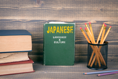
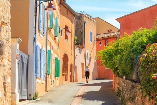
Designers are required to have different skills depending on the country. If you are a foreigner who wants to change careers and become a designer at a Japanese company, you should start by doing some research to find out what the design situation is like in Japan.
In this article, we will introduce tips for working as a designer in Japan and the differences between the characteristics of design in Japan and other countries to foreigners who want to work as designers in Japan. If you are looking for a job as a designer, please use the IT industry job-placement agency “G Talent”, which is a recruitment agency that brings together global companies.
Contents
- 1 Tips for foreigners working as designers in Japan
- 1.1 Include necessary information while focusing on convenience
- 1.2 Be careful about the different impressions created by different colors
- 1.3 Use capital letters to emphasize
- 1.4 Design using a combination of hiragana, katakana and kanji
- 1.5 Text can also be written vertically
- 1.6 Sometimes the text itself is used as an illustration
- 1.7 Important to be aware of the sense of the season
- 2 Differences between design in Japan and design in other countries
- 3 Let's find out some tips for foreigners working as designers in Japan!
Tips for foreigners working as designers in Japan

If you want to work as a designer in Japan, make sure you keep the following seven points in mind. This will help you understand the patterns that are often used or required of designers in Japan.
- Include necessary information while focusing on convenience
- Be careful of the different impressions created by different colors
- Use capital letters to emphasize
- Design using a combination of hiragana, katakana and kanji
- Text can also be written vertically
- Sometimes the text itself is used as an illustration
- Important to be aware of the sense of the season
Include necessary information while focusing on convenience
In Japan, web design emphasizes convenience with the aim of “making it easy for users to find the information they want”. For example
- The latest update information and event information is posted on the top page
- The menu is simple and easy to understand
If users judge that it is easy to find the information they want when they first visit the site, it will be easier to gain their trust.
Reference: UI(ユーザーインターフェース)とは?意味やデザインのポイント/DENTSU MACROMILL INSIGHT
Be careful about the different impressions created by different colors
People's impressions of colors differ depending on the country or region. This is also true even within the same Asian region, and there are colors that have a positive image in Japan but a negative image in other countries. When sending information to users in Japan, it is important to remember the following color images as perceived by Japanese people.
| Color Type | Impression on Japanese people |
|---|---|
| White | Clean, sacred, bright, good |
| Red | Hot, passionate, active, energetic, angry |
| Orange | Bright, healthy, warm, fun |
| Yellow | Joy, happiness, attention |
| Green | Nature, healing, calm, healthy |
| Blue | Smart, fresh, cool |
| Purple | Noble, mysterious, feminine |
Reference: 色の持つイメージが与える心理的効果とは?チラシデザインの広告効果を高めよう!/販促の大学
Use capital letters to emphasize
In the West, English sentences and words written in capital letters give the impression of being “attention-seeking” and negative, but in Japan, they are often used not to convey a good or bad image, but as a way of emphasizing the parts you want people to read, as a way of making the text easier to read.
For example, in Japan, capital letters are often used when publishing company slogans, etc. You also need to be careful about how you use the alphabet.
Reference: 大文字と小文字/デザイナーの英語帳
Design using a combination of hiragana, katakana and kanji
There are three types of characters in Japanese: hiragana, katakana and kanji, and words and sentences are written using a combination of these. There are many different ways to combine these characters, so you can create a design by arranging the combination that best matches the image you want to convey. You can also add English words to create a sentence.
If you look at web designs that have actually been created for Japanese users, you will see that various character combinations are used to good effect.
Reference: 日本のデザインスタイルは、そのままでは海外で通用しない/ぐれこブログ
Text can also be written vertically
Compared to the alphabet, which is not suited to vertical writing, Japanese can be written both horizontally and vertically. In addition, for people whose native language is Japanese, vertical writing is the natural way of seeing things.
For non-Japanese designers who use Japanese as a second language, it may seem unfamiliar. To get used to vertical writing, try walking around town and looking at signs written in Japanese, or checking out Japanese websites.
Sometimes the text itself is used as an illustration
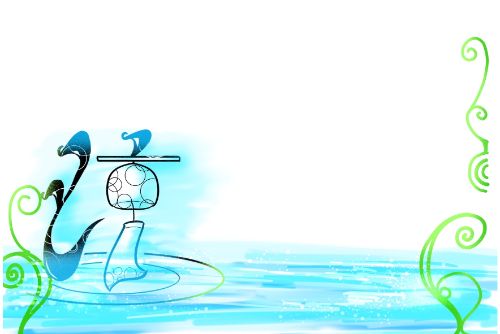
In Japan, it is common to emphasize text by illustrating it in advertisements and signs. In particular, Japanese kanji are characters that are easy to illustrate. Kanji are made up of a combination of the “left” radical (on the left), the “right” radical (on the right), the “top” radical (on the top), and the “bottom” radical (on the bottom), but by illustrating some of these, it becomes easier to visually convey the message to the user.
For example, if you use an illustration of a fish for the fish radical and an illustration of a tree for the tree radical, it will be easier for users to form an image in their minds before they even think about it.
Reference: 偏旁冠脚/goo辞書
Important to be aware of the sense of the season
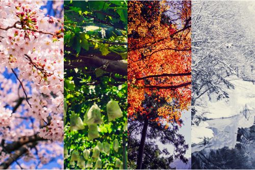
Japan is a country where you can clearly feel the differences between spring, summer, autumn and winter. Japanese people and foreigners who are used to living in Japan have a common image of each season. Therefore, it is recommended to incorporate illustrations of seasonal events and designs that evoke a sense of the seasons into web designs for Japanese users, as this will help to create a good impression and make it easier to convey information accurately.
| Seasons | Impressions received by Japanese people |
|---|---|
| Spring | Cherry blossoms, entrance ceremonies, new life, pink |
| Summer | The sun, sunflowers, shaved ice, beer, swimming, fireworks |
| Autumn | Autumn leaves, persimmons, chestnuts, grapes, saury, sports day |
| Winter | Snow, snowflakes, Christmas, New Year, mandarin oranges |
Reference: 季節や月別の色のイメージとは?デザインに落とし込むコツもご紹介!/mitekaku
Differences between design in Japan and design in other countries
The internet is now a tool that allows us to easily connect with the world. Even if you are a web designer in Japan, you need to keep in mind that your website will be viewed by users not only in Japan but also in other countries around the world. In this section, we will introduce some of the trends and characteristics commonly seen in design in Japan and other major countries.
Characteristics of Japanese design
Japanese websites, including the index page, which is the first thing users see, tend to include as much information as possible. This is particularly true of websites that are accessed by a wide range of users, and one of the characteristics of these sites is that they tend to have little white space. However, in Japan, there is a minority of users who view websites without scrolling.
On the other hand, there are many websites that have adopted the latest design trends to make their content easier to read, and these sites tend to have a core audience.
It is true that many Japanese users want to obtain the information they need as quickly as possible. For this reason, it is important to use access analysis and other tools to analyze which content is needed, and to narrow down the items displayed on each page.
Reference: 世界各国のWebデザインと日本のWebデザインの特徴/ManaのWebクリエイターカフェ
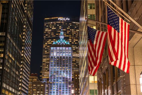
Characteristics of American design

The United States has been a pioneer in the development of the web industry, and as a web-advanced country where the latest designs are constantly being created, many sites incorporate the latest designs. Specifically, although simple designs that use only images and headline text are generally common, the rationality of being able to easily find links to the items you really need is a feature that is also expressed on the site. Unlike sites for Japan, which emphasize the amount of information, it can be said that they emphasize images.
In addition, since originality, humor and impact are highly praised in this country, “vivid colors” and “energy” are also emphasized in design.
Reference: 日本とアメリカのデザインの違い/ルートメロン研究所
Characteristics of French design
Even in France, which is one of the Western countries, there are many minimalist sites that are as simple as American sites and display minimal content, so it can be judged that images are also emphasized here. However, when it comes to color, there seems to be a preference for simplicity and intelligence, such as “adding a theme color to black and white”. There is no need to limit yourself to the tricolor of the French flag (blue, white and red), but by considering these three colors as the basis of your design, you should be able to create a safe and smart site.
Reference: フランスと日本のデザインの違い/西方見聞録(旧パリレポート)
Characteristics of Saudi Arabian design
In Saudi Arabia, where there are many Muslims in the Arab world, there is a tendency for sites to be designed using images that make a strong first impression. The key is to use images that make a strong impact and make people want to click on them. This is a fundamentally different approach to design from that of Japanese sites, which do not place such importance on impact.
Characteristics of Chinese design
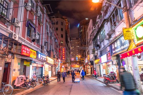
China has many things in common with Japan's design, which is also in the Asian sphere, and it seems that web designs reminiscent of busy neon streets and signs are popular. Many sites use more colors than in Japan to pack in information, and the text and fonts are larger, and many pages are longer.
In addition, because of the many information restrictions in China, it is difficult to access services and tools that are common overseas, such as Google, YouTube and Instagram. The same is true of Google Maps, so you will need to be creative when creating social networking share buttons and links to maps.
Reference: 制作前に知っておきたい、中国国内向けWebサイトの開発・デザインの注意点/DESIGN JOURNAL
Let's find out some tips for foreigners working as designers in Japan!
Web design preferences and characteristics differ depending on the user's country of origin. If you are a foreign designer looking for work in Japan, it is important to focus on designs that Japanese users are familiar with and find easy to use.
Japanese people tend to want a lot of information to be visible at a glance on the top page of a website. However, it is not enough to just have a lot of information - if you carefully select the information that is really necessary and post it, it will be easier to find the links and the design will also improve.
If you are looking for a job as a designer in Japan, we recommend “G Talent”, a job-placement agency for foreign IT engineers. It also lists many job openings at venture companies and global companies with English-speaking environments, so you can find a job as a designer that suits you.